Some companies have a product problem. They’ve built something that doesn’t quite work, doesn’t quite fit the market, doesn’t quite justify its price point.
Advanced Microfluidics had the opposite problem.
They had built technology that was genuinely exceptional, microfluidic systems used in scientific research and industrial applications, developed by some of the best engineers in Switzerland. The product was not the issue. The brand was.
When we first encountered Advanced Microfluidics, their visual identity and communication didn’t reflect the quality of what they’d built. A company operating at the frontier of scientific precision was presenting itself with a brand that felt generic, dated and disconnected from the world-class work happening inside the organization.
This is a more common problem than most companies realize, especially in deep-tech, engineering and scientific sectors, where the founders’ attention is (understandably) focused on the product rather than the brand. The result is a credibility gap : the company is better than it looks, and potential clients and partners don’t know it.
Here’s how we closed that gap for Advanced Microfluidics, and what the process taught us about rebranding international companies for European markets.
Starting with immersion, not assumptions
The first thing we did was not open a design tool. It was not write a brief. It was not present mood boards.
The first thing we did was learn.
We immersed ourselves in Advanced Microfluidics’ world, their technology, their clients, their competitive landscape, their ambitions. We talked to the team. We understood what microfluidics actually is, what problems it solves, who uses it and why it matters. We studied how their competitors were positioning themselves across Europe. We identified the gap between how Advanced Microfluidics was perceived and how they deserved to be perceived.
This immersion phase is non-negotiable for us, especially on international projects. A Swiss deep-tech company operates in a specific cultural and professional context. The way credibility is communicated in Swiss B2B scientific markets is different from how it is communicated in French markets, in German markets, in UK markets. Getting that wrong at the brand level is an expensive mistake.
The immersion told us three things clearly.
First : Advanced Microfluidics’ real differentiator was precision, not just technical precision, but the kind of obsessive, uncompromising precision that characterizes the best Swiss engineering. That needed to be the spine of the new brand.
Second : their target audience, researchers, engineers, procurement managers in scientific institutions and industrial companies, responded to credibility signals that are very specific to their world. Peer validation, publication references, technical specificity, institutional partnerships. The brand needed to speak that language fluently.
Third : the European market for microfluidic technology was consolidating around a small number of players who were investing seriously in their brand presence. Advanced Microfluidics had a window to establish a premium positioning before the market matured, but that window required moving quickly and confidently.
The rebranding, what we built and why
Armed with the immersion findings, we built a brand identity system designed to do one thing above all else : make Advanced Microfluidics look and feel as exceptional as their technology actually is.
Visual identity
The new visual identity was built around the concept of precision at scale, a reference both to the microscopic world of microfluidics and to the rigor of Swiss engineering culture. Clean geometry, controlled color palette, typography that communicated both scientific authority and modern sophistication.
Every visual decision was deliberate. The color palette was chosen to differentiate Advanced Microfluidics from the generic blue-and-white that dominates the scientific instruments sector, close enough to category conventions to feel credible, distinct enough to be memorable. The typography balanced technical authority with accessibility, communicating expertise without exclusivity.
Brand platform
Beyond the visual identity, we built a brand platform that gave Advanced Microfluidics a clear, ownable position in the European market : the company that brings Swiss precision to the frontier of microfluidic science.
This platform gave the team a foundation for every communication decision, from website copy to conference materials to client presentations. Instead of describing what they do (microfluidic systems), they could now articulate why it matters and what makes them different from every other company doing it.
Website redesign
The visual identity and brand platform fed directly into a complete website redesign. The new site was built to serve two audiences simultaneously : the scientific community, who needed detailed technical credibility, and procurement and business development contacts, who needed clear commercial clarity.
This dual-audience challenge is typical of deep-tech B2B companies entering European markets. The person who evaluates the technology and the person who signs the contract are often different people with different information needs. A website that serves only one of them leaves revenue on the table.
Your brand identity should reflect the quality of what you actually do. If it doesn't, we'll tell you exactly what needs to change. You've read this far — which means you have a real project. No need to dance around it.
We structured the site to give each audience what they needed without sacrificing coherence, technical depth available for those who wanted it, commercial clarity front and center for those who needed it first.
What the European market context required
Rebranding for the European market, rather than a single national market, introduced specific constraints and opportunities that shaped every decision.
Language and cultural neutrality
A brand operating across multiple European markets needs to avoid cultural specificity that works in one country but falls flat in another. The Advanced Microfluidics brand was built to feel credibly Swiss, which carries strong positive associations across European scientific and industrial markets, without being so culturally specific that it felt foreign in France, Germany, the UK or the Nordics.
This is a delicate balance. Too generic and you lose the authenticity that makes a brand trustworthy. Too specific and you create friction in markets where the cultural codes are different.
The Swiss quality signal
Switzerland carries enormous brand equity in European B2B markets, particularly in precision engineering, scientific instruments and industrial technology. This is an asset that many Swiss companies underuse. Advanced Microfluidics’ previous brand did not leverage this equity effectively.
The new brand made Swiss origin an explicit part of the positioning, not as a geographic fact, but as a quality signal. For European buyers evaluating microfluidic technology partners, Swiss engineering heritage is a meaningful differentiator. The rebrand made sure they knew it immediately.
Multi-language readiness
A European brand needs to work across multiple languages without losing its integrity. We built the Advanced Microfluidics brand system with multi-language deployment in mind, ensuring that the visual identity, the tone of voice guidelines and the core messaging translated coherently across French, English and German without requiring a separate brand system for each market.
What this case teaches about international rebranding
The Advanced Microfluidics project illustrates a broader truth about rebranding international companies, one that applies whether you’re a Swiss deep-tech firm entering the European market or a US consumer brand entering France.
The brand gap is usually invisible from the inside.
Companies that live with their brand every day stop seeing it clearly. The gap between how the brand looks and how the company actually performs becomes background noise. It takes an outside perspective, ideally one grounded in genuine immersion, to see the gap and understand what it costs.
Technical excellence does not communicate itself.
In every sector, there are companies with genuinely superior products that underperform commercially because their brand doesn’t reflect their quality. This is especially common in deep-tech, engineering and scientific sectors, where the founders’ expertise is technical, not communicative. The rebrand is not a cosmetic exercise. It is a commercial one.
European market entry requires brand infrastructure, not just brand assets.
A logo and a color palette are not enough. A company entering the European market needs a complete brand system, visual identity, brand platform, tone of voice, website, sales materials, that can be deployed coherently across multiple markets, multiple languages and multiple audience types. Building this infrastructure upfront is significantly more efficient than building it market by market.
Immersion is not optional for international projects.
The reason the Advanced Microfluidics rebrand worked is that we understood their world before we started designing it. That understanding only comes from genuine immersion, talking to the team, studying the market, learning the language of the sector. Agencies that skip this step produce beautiful work that doesn’t fit. We’ve seen it happen. We don’t let it happen on our projects.
The result
Advanced Microfluidics went from a brand that looked like a generic scientific instruments company to a brand that looked like what they actually are : a world-class Swiss precision engineering firm operating at the frontier of microfluidic science.
The new identity gave their team confidence in every commercial interaction, from trade shows to investor presentations to client pitches. It gave their European prospects an immediate, accurate signal of quality before a single technical specification was discussed.
And it gave Advanced Microfluidics something that their previous brand had never given them : a foundation to grow from.
Explore more:
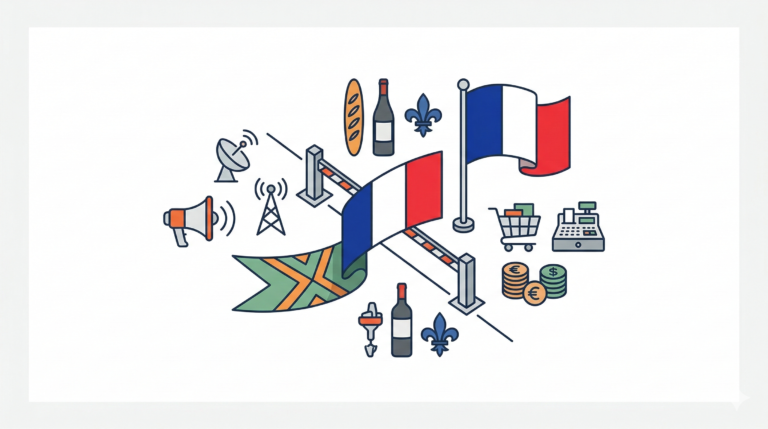
→ How to Enter the French Market, Practical Guide
→ Why Anglo-Saxon Marketing Fails in France
→ French Brand Content Benchmark 2026
→ More case studies with results